What the rule says about your font
The regulation describes how the type behaves, not which font you buy. Any typeface works as long as it does all of this:
| Requirement | What it means when you pick a font |
|---|---|
| A single easy-to-read type style | One family for the whole panel. The one exception: the word "trans" may be in italics |
| Upper and lower case letters | No all-caps panel on a normal-size package |
| Letters never touch | Watch condensed fonts and tight letter spacing at 8 point |
| At least 1 point of leading, 4 points on nutrient lines | Space between lines; the nutrient and vitamin lines need the most |
| Bold or extra bold for highlighted items | Your font needs a real bold weight |
| No reverse printing as highlighting | White text on a black band doesn't count as bold |
| All black or one color type | On a white or other neutral background whenever practical |
The font FDA itself uses
FDA publishes the graphic specifications behind its sample labels in Appendix B to Part 101, and strongly recommends them for a uniform look. They are a recommendation, not a requirement. FDA's labeling guide says any legible type style may be used, not just Helvetica.
| Element | FDA's example |
|---|---|
| "Nutrition Facts" | Franklin Gothic Heavy or Helvetica Black, flush left and flush right |
| Bold lines | Helvetica Black |
| Regular lines | Helvetica Regular |
| "Calories" and the calorie number | 16 point and 22 point Helvetica Black |
| Nutrient amounts and indented nutrients | 8 point Helvetica Regular, 4 points of leading |
| Footnote | 6 point Helvetica Regular, 1 point of leading |
| Kerning | As tight as -4 to fit some formats, though tighter kerning reduces legibility |
| Rules | 7 point and 3 point bars, hairline or 1/4 point rules between nutrients, a 1/2 point box |
Minimum sizes and what our label uses
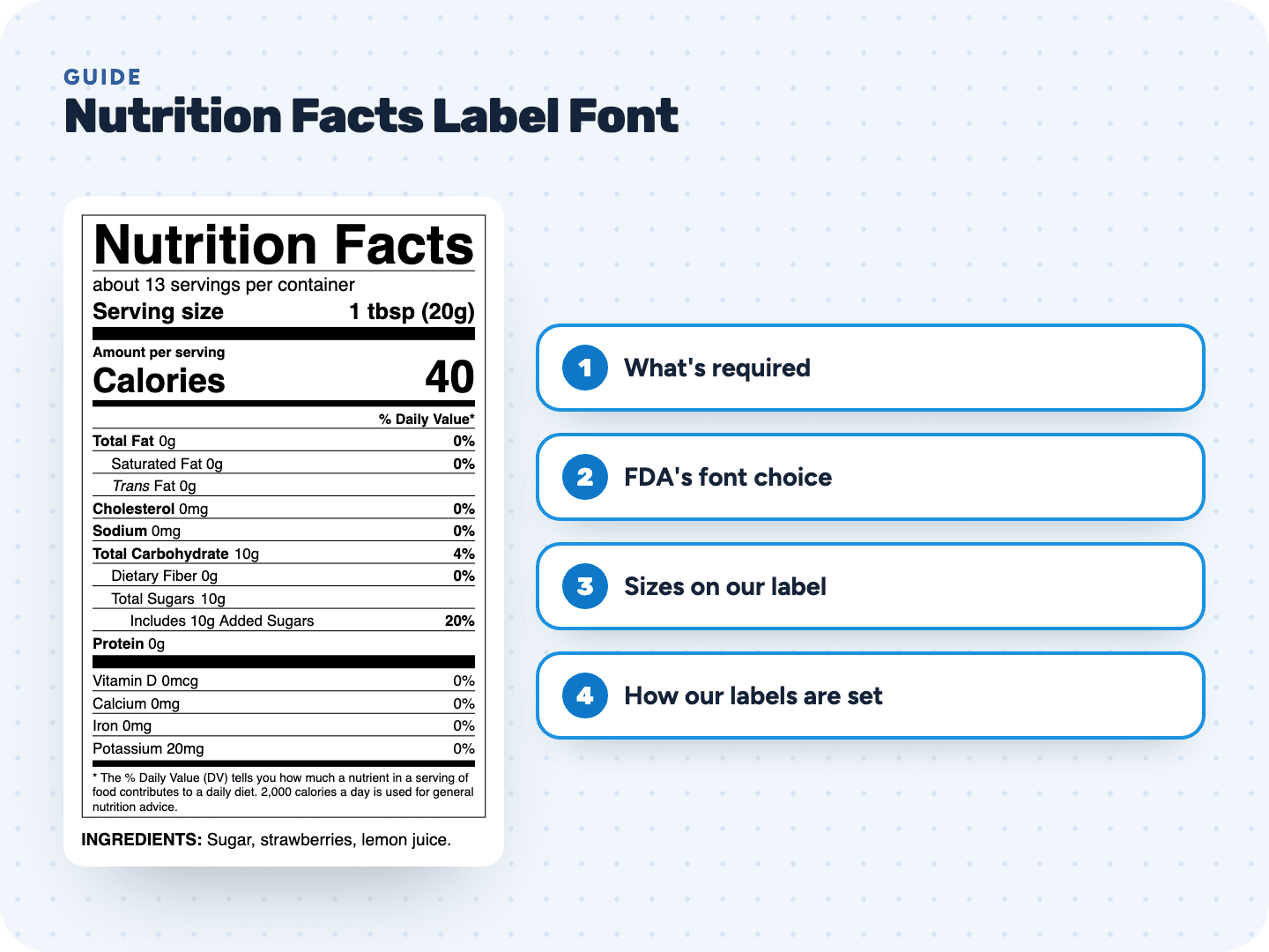
Here is every line of the standard vertical label: the FDA minimum, whether it must be bold, and the size our tool actually prints.
| Line | FDA minimum | Bold | Our standard label |
|---|---|---|---|
| "Nutrition Facts" | No smaller than any other text except the calorie number | Yes | About 29 pt, full width |
| Servings per container | 10 pt | No | 10 pt |
| Serving size | 10 pt | Yes | 12 pt |
| "Amount per serving" | 6 pt | Yes | 7.5 pt |
| "Calories" | 16 pt | Yes | 18 pt |
| The calorie number | 22 pt | Yes | 24 pt |
| "% Daily Value*" | 6 pt | Yes | 7.5 pt |
| Nutrient lines | 8 pt | Main nutrients and their %DV | 8 pt |
| Vitamins and minerals | 8 pt | No | 8 pt |
| Footnote | 6 pt | No | 6.5 pt |
The "Nutrition Facts" title is the one line without a fixed number. It has to run the full width of the nutrient list unless that's impractical, and on a 3 inch label that makes it the biggest type on the panel.
How our labels set the type
- Helvetica and Helvetica Bold in the PDF; Helvetica, or Arial where Helvetica isn't installed, in the SVG
- "Trans" in italics, the one change of style the rule allows
- Every heading, the main nutrient names and their %DVs in bold; indented nutrients, amounts and vitamins in regular
- 8 point nutrient lines on a 12 point row: the 4 points of leading the rule asks for
- 0.5 point hairlines between nutrients, and solid bars above and below the calorie block and the vitamins
- Black type on white, inside a box
- The ingredient list and Contains line under the label in 9 point, so a lowercase o stays above 1/16 inch
The PDF downloads at actual size. Place it at 100% and every size in the table above prints exactly as listed. Shrink it in your layout file and they all shrink with it.
Setting the label in your brand font
Nothing stops you from using your brand typeface, as long as it passes the rules above. Before you swap it in, check these:
- It has a true bold or black weight. A thin outline added to regular text is not the same
- It stays readable at 8 point, with clear numbers: 0 and 8, 1 and 7 should not blur together
- No script, handwritten or decorative faces. They fail the easy-to-read test
- Condensed widths make letters touch faster. Test the longest line, Total Carbohydrate, at 8 point
- The whole panel uses that one family. Don't mix a display font in the title with a different body font
- Fonts with small lowercase letters look smaller at the same point size. If yours does, go up a size rather than down
Most brands keep the panel in Helvetica or Arial and put their own typeface on the rest of the package. Shoppers know that look, and it removes the guesswork.
When smaller type is allowed
- Tabular and linear displays for small packages: "Calories" may drop to 10 point and the calorie number to 14 point
- Servings and serving size may be 9 point in those small-package displays
- Under 12 square inches of label space, a panel you print anyway may drop to 6 point throughout, or be set in capitals no less than 1/16 inch high
Our small formats are set to these minimums, not below them. The Small package (linear) label prints its nutrients at 8 point, servings and serving size at 9 point, Calories at 10 point and the calorie number at 14 point. The Tabular label keeps servings per container at 10 point, the serving size at 9 point, Calories at 10 point and the calorie number at 22 point.