What FDA requires of the type
| Rule | What it means in practice |
|---|---|
| A single easy-to-read type style | One font family for the whole panel |
| Upper- and lowercase letters | All caps only on packages under 12 square inches of label space |
| At least 1 point of leading | A little air between every two lines |
| Letters that do not touch | Careful with condensed fonts and tight spacing |
| All black or one color type | On a white or other neutral background whenever practical |
| The title and all headings in bold | "Supplement Facts" plus headings like "Amount Per Serving" |
Minimum type sizes
| Text in the panel | Minimum size |
|---|---|
| Title, "Supplement Facts" | Larger than all other print in the panel, full width unless impractical |
| Dietary ingredients, amounts, %DV and the rest of the information | 8 point, one uniform size |
| Column headings, like "Amount Per Serving" and "% Daily Value" | 6 point |
| Footnotes, like "Daily Value not established" | 6 point |
The key word is uniform. Vitamin C, the botanical extract and the proprietary blend all sit in the same size. You can't enlarge the star ingredient or shrink a long list of minerals to make it fit. Only the title, the headings and the footnotes sit outside that one size.
Proprietary Blend →How the font rules differ from Nutrition Facts
The two panels look related, but their type rules aren't the same. If you design both food and supplements, these are the differences that trip people up:
| Nutrition Facts | Supplement Facts | |
|---|---|---|
| Title size | No smaller than any other text, except the calorie number | Larger than all other print, no exception |
| Calories | 16 point word, 22 point number | Same uniform size as the other lines, when listed |
| Main body | 8 point nutrient lines, 10 point servings | 8 point, uniform throughout |
| Smallest allowed on tiny packages | 6 point under 12 sq in | 4.5 point under 12 sq in |
| All capitals | Only under 12 sq in, at least 1/16 inch tall | Allowed under 12 sq in |
Hairlines and bars
- The whole panel is enclosed in a box made of hairlines
- A hairline, centered between the lines of text, separates every dietary ingredient from the next
- A heavy bar sits under "Servings Per Container", or under "Serving Size" when servings per container is not declared
- Another heavy bar follows the last vitamin, mineral or other nutrient with a Daily Value
- A heavy bar follows the last ingredient without a Daily Value, like a botanical or a blend
- A light bar sits under the headings "Amount Per Serving" and "% Daily Value"
Small bottles and sachets
| Space for labeling | Minimum type size |
|---|---|
| Less than 12 sq in | 4.5 point |
| 12 to 40 sq in | 6 point |
| Less than 20 sq in, more than 8 dietary ingredients | 4.5 point |
| 20 to 40 sq in, more than 16 dietary ingredients | 4.5 point |
- If even 4.5 point with hairlines won't fit, the hairlines may be replaced by rows of dots linking each name to its amounts
- An inner container sealed inside outer packaging may use smaller type, as long as the outer package carries a full-size panel
Our Supplement Facts panel is built at full size, with 8 point ingredient lines. It does not shrink to these small-package sizes, so for a very small bottle, plan the label space around a full panel or have your designer set the reduced version.
The font FDA recommends
No font is required. For a uniform look, FDA urges supplement makers to follow the graphic specifications in Appendix B to Part 101, as applicable. Those specifications are written for the Nutrition Facts label and use Helvetica Black for bold text and Helvetica Regular for the rest.
How our Supplement Facts panel is set
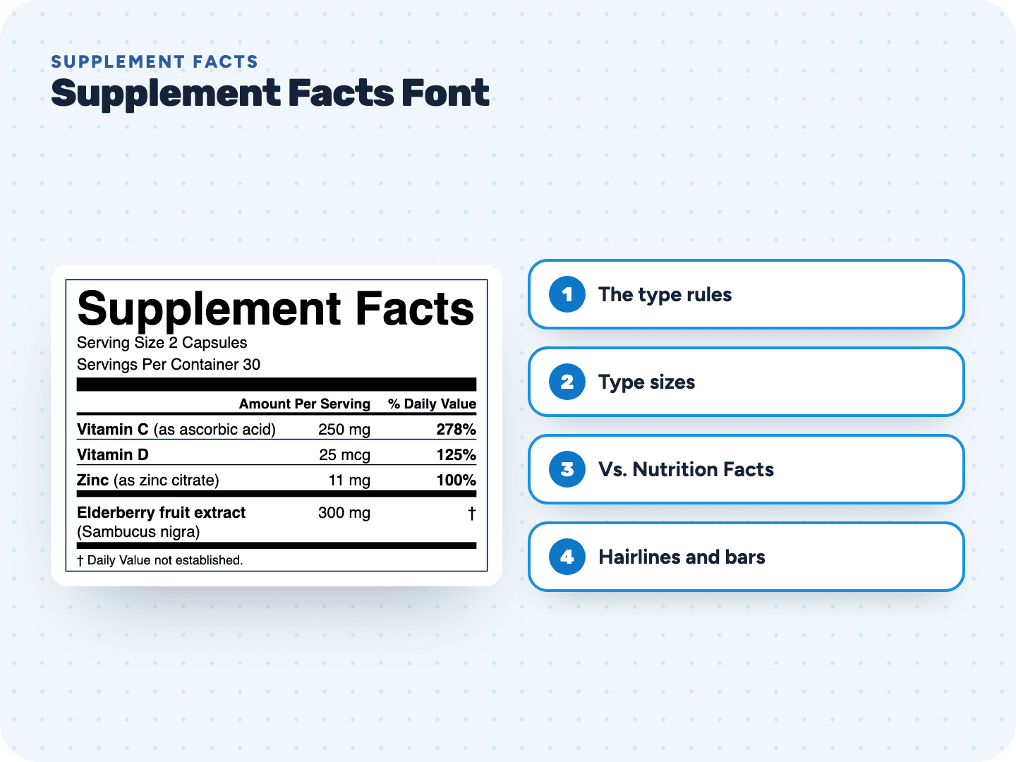
- Helvetica throughout, with "Supplement Facts" in bold, stretched to the full width of the 3 inch panel (about 24 point)
- Every ingredient line, amount and %DV at 8 point
- "Amount Per Serving" and "% Daily Value" in 7 point bold
- Footnotes at 6.5 point
- Hairlines between ingredients, a heavy bar under the servings, heavy bars after the nutrients and after the other ingredients, and a light bar under the headings
- "Other ingredients" printed under the panel in 9 point
You enter vitamins and minerals with their source, botanicals, proprietary blends and other ingredients. The tool lays out the panel and exports it as a vector PDF, SVG or 600 dpi PNG.
Make your Supplement Facts panel →